Wednesday, October 1, 2008
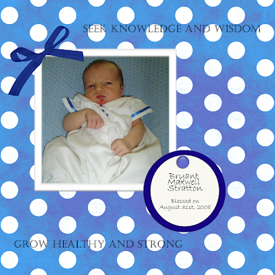
Bryant's Blessing
I didn't really do much with this one. Played around with some effects. Need to figure out how to do the shadows better. And I really wish Photoshop would show me what the fonts look like the way that Word does. Right now I have to select the font to see how it will look. I wish the font name was written in the style of the font. I hope that makes sense. Oh yeah, I made the tage myself. Next time I think I will play around with texture more though, so it looks better. But I think it looks okay for a first attempt.


Subscribe to:
Post Comments (Atom)


2 comments:
Your page didn't show up.
It's here this time. It looks really good. I like it. Simple, but yet nice. I like how you got the colors to match. And the wording is great.
Post a Comment